It’s no secret that data can be difficult to analyze. After all, data is nothing more than a bunch of numbers and letters, and it can be tough to make sense of it all. But that’s exactly what businesses need to do in order to make sound decisions and stay ahead of the competition.
Luckily, there are plenty of tools and techniques available to help make data analysis a little bit easier, including data visualization. Data visualization is the presentation of data in a graphical or tabular form.
It is a way to communicate information by using visuals such as graphs, charts, and maps. Visuals can help you see patterns and trends in your data that might be difficult to see in text form so you can make decisions, identify problems, and explore data.
There are many different ways to visualize data, including bar charts, line charts, scatter plots, pie charts, and radar charts. Keep reading to learn more about what is a radar chart and how to use one.
What Is A Radar Chart?
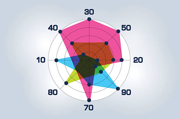
A radar chart, also known as a spider chart, is a graphical representation of data that uses a radial layout to display values for multiple dimensions.

The radius of each circle is proportional to the value of the data point, and the position of each circle is determined by the value of the data point’s associated dimension.
This type of chart is often used to display performance data, as it allows you to quickly and easily compare data points along multiple dimensions.
How Do You Create A Radar Chart?
There are a few different ways to create a radar chart. The most common is to use a spreadsheet program like Excel. First, you need to create a table with the data you want to visualize.
Then, you can use a charting tool to create the radar chart. Excel has a built-in tool for creating radar charts. To use it, first select the data you want to include in the chart.
Then, go to the Insert tab and select the Chart tool. In the menu that pops up, select Radar and then click OK. Excel will create a chart that looks like a spiderweb.
What Are The Advantages Of Radar Charts?
Radar charts are a great way to compare and contrast data sets because they allow you to see the distribution of data points for each data set. This makes it easy to identify any outliers or clusters of data points.

For example, you can use a radar chart to compare the sales figures for different products. This will help you to identify any products that are selling particularly well or poorly.
Radar charts are also useful for comparing data sets that are on different scales. For example, you can use a radar chart to compare the number of tweets that different celebrities have received.
This will help you to identify which celebrities are the most popular on Twitter. Additionally, radar charts are a great way to highlight the differences between two data sets.
For example, you can use a radar chart to compare the number of website visits that two different companies have received. This will help you to identify which company is performing better online.
How Can Radar Charts Be Used In Business?
Radar charts are an effective way to visualize data when there are multiple variables to consider. They can be used to compare data sets, track changes over time, or show how different factors are related.

There are a number of ways businesses can use radar charts to improve decision-making. For example, radar charts can be used to compare different product lines to see which ones are most popular or to see how sales have changed over time.
This can help businesses make decisions about which products to focus on and which ones to discontinue.
Radar charts can also be used to track customer satisfaction over time. This can help businesses identify trends and determine which areas need improvement.
Additionally, radar charts can be used to compare different marketing campaigns to see which ones are most effective. This can help businesses optimize their marketing efforts and get the most out of their budget.
Further, radar charts can be used to evaluate employee performance. This can help businesses identify which employees are performing well and which ones need improvement.
Finally, radar charts can be used to analyze financial data. This can help businesses track their expenses and make more informed financial decisions.
In summary, radar charts are useful data visualization tools that can give you insight into your business performance.