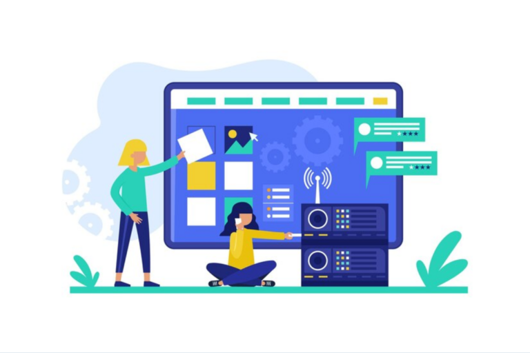
The fastest way to promote the products and service, as well as to present a new type of product, is simply by making the website suit your needs. The purpose of your website’s existence is your customers, and most of your customers will make their decision based on what they see on your homepage.
Hence, the design of your webpage must be in line with the quality of your products. Making an aesthetically pleasing homepage is the initial step since most of the customers are more likely to land on your homepage before they decide to explore some other options, and it is for your best advantage to keep them exploring, and this will not be quite possible if it is not well-composed. Hence, here are some examples of how to make your business website more eye-catching.
The First Rule, Rule of Simplicity
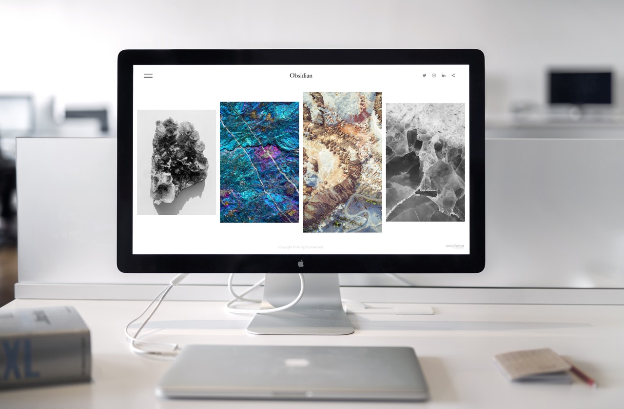
A lot of things about modern web design suggest that the simpler, the better. Even though it seems that if you fill your homepage with a whole variety of different special effects, loads of information, and moving images, you can, unfortunately, cause the contra effect.
Namely, extra content-loaded web pages are too difficult to navigate and are particularly demanding to use for the person that matters the most-customer. On the other hand, simplicity and efficiency make people happy since all the necessary things are well-organized and simple to use, and that consequently increases the chances for your customers to spend money.
In order to keep your web page simple, bear in mind your business and what is the field of your functioning. Your website will give you all the instructions on how to find the things your customers are interested in, and how to get them.
Your website’s functionality will increase the traffic and will make the sales rates higher when it comes to your products and services. Here are a couple of tips on how to increase the simplicity of the web design and some of them are avoiding distractions, a bunch of ads, and clutter; do not get too carried away with the special effects; make sure that the text blocks are simple and that they define one idea at the time; it is for the best to exclude the accordions, carousels, and pop-ups, etc.
These aspects are some of the most important for e-commerce and will give you the possibility of simple updating and editing. A simple web design saves you time and money, will serve you long-term, and all of your customers will have a functional web page.
The Practicality of the Visual Hierarchy
When you are starting the process of your web page making, it is important for you to sort out the priorities and make your homepage’s layout that will put visual hierarchy as the main priority. Visual hierarchy is a collection of smart guidelines that assist designers to make better visual judgments while creating the overall concept of a web page design, with the major focus on identifying and ordering the most significant components and features according to their significance.
Some elements to pay attention to are the color and contrast (namely, bright colors will draw attention and dramatic contrast does the same), the next on the list is the typographic hierarchy referring to the text order, what to read first, and experience has shown that big text wins; moreover, apply the rule of thirds (balance for picture framing) and rule of odds (placing the surrounded element in the focus).
There are also some other rules, such as “white space”. This is one of the essential rules, and it refers to the not-so-good space in your web design. However, you should bear in mind that the simpler your page is, the better results it will have.
Website Navigation
The crucial part about your website is definitely navigation, which in a way dictates the usability of the website. Since this is one of the crucial things, it is important to say that, combined with a good web design, it will result in good site traffic and will eventually lead to an increased number of sales. There are a couple of things to consider, such as the menu on the top and on the side of the page.
When composing your website, it is important to bear in mind that design is not the last thing to consider, and this is due to various causes. Customers are more likely to lend the order if the website is well-composed and functional, which will leave them almost no space to wander.